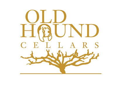


Old Hound Cellars is a small-production California wine company. The founders, two graduates from Cal Poly San Luis Obispo, were in need of a logo to begin establishing the brand.
Creative Brief:
The logo parameters were to include: 1. a hound as a tribute to the name, and 2. a specific type of vine called a head trained vine.
Process:
Extensive industry research—including visits to vineyards and wine retailers—sparked a creative exploration that led to a versatile and intricate logo design. Drawing inspiration from Herb Lubalin’s iconic “Mother & Child” logo, the design strategically links imagery with typography through a stacked composition. The choice of the transitional typeface Baskerville, noted for its traditional elegance and distinctive “O”, reinforces the brand’s classic appeal, while complementary sans serif and script fonts in the label balance modernity with tradition.
The brand identity extends seamlessly into packaging, featuring a wine label series and a thoughtfully designed gift box targeted towards an affluent wine enthusiast audience. Custom patterns derived from the logo’s branches establish a cohesive series identity, with each wine boasting a unique design element and the gift box uniting all four through an integrated pattern.
This project highlights my expertise in identity development and branding by combining research, creative design solutions, and strategic visual storytelling to elevate the client’s brand presence.
Creative Brief:
Identity / Brand
Graphic / Print Design
Packaging Design
