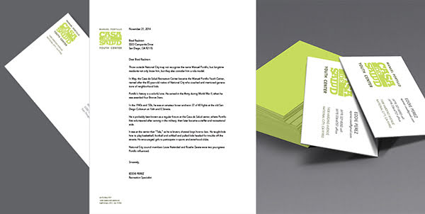
The Manuel Portillo ‘Casa de Salud’ Youth Center is a free, city-funded after-school program. It is a place for kids and teens to hang out with friends while engaging in social and learning activities.
Creative Brief:
The youth center sought to be branded to appeal to a wider audience and increase its awareness and attendance. The goals were to appeal to the community it serves, increasing community outreach, getting volunteers involved, and increasing donations to fund more programs, field trips and equipment for the kids.
Process:
My process started with a discovery period of researching youth and community center brands. I also conducted observational research by visiting Casa de Salud during operational hours. My research found that many youth center brands focused on abstract interpretations of people as their mark. Adhering to this theme, initial concepts drew inspiration from the abstract work of Spanish surrealist painter, Joan Miró because of his “child-like” style. Other explorations included expressing the brand attributes of movement, action, culture, unity, and gathering. The final logo—a typographic interpretation of “papel picado” or traditional Mexican paper banners—was chosen to honor the youth center’s cultural roots and align with its Spanish name, “Casa de Salud,” reflecting the community’s strong Mexican heritage. The final deliverables were comprised of the brand identity and a communications package.
Skills:
Identity / Brand
Graphic Design
